In this tutorial, you will learn how to create Kibana visualization dashboards for ModSecurity logs. This tutorial is a continuation of our previous tutorial on how to process and visualize ModSecurity Logs on ELK Stack where we covered various grok filters/regular expressions for extracting various fields from the ModSecurity audit logs. Hence, before you can proceed, ensure that you have checked the tutorial by following the link below.
Process and Visualize ModSecurity Logs on ELK Stack
Create Kibana Dashboards for ModSecurity Logs
Once you have created and verified your ModSecurity logstash filters, proceed to create visualization dashboards for your ModSecurity logs based on the fields extracted by your filters.
Kibana visualizations are based on Elasticsearch queries. By using a series of Elasticsearch aggregations to extract and process your data, you can create charts that show you the trends, spikes, and dips you need to know about.
There are different types of Kibana visualizations that you can use with the most fequently used including;
- Line, area, and bar charts — Compares different series in X/Y charts.
- Pie chart — Displays each source contribution to a total.
- Data table — Flattens aggregations into table format.
- Metric — Displays a single number.
- Goal and gauge — Displays a number with progress indicators.
- Tag cloud — Displays words in a cloud, where the size of the word corresponds to its importance.
You can create Visualizations on Kibana by navigating to Visualize menu.
Hence, click on the three menu lines at the top left corner on Kibana web interface > Visualize > Create visualization.
From there, you can now choose the type of Visualization you want to create.
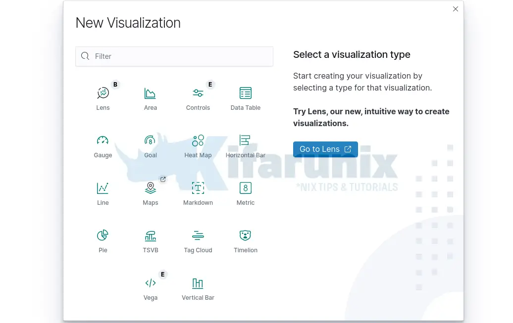
Top 10 Attacks
To create Kibana Visualization for the ModSecurity Top 10 attacks, we will use a pie chart.
Therefore click Pie on the visualization window above.
Choose the your data source index. In this case, we use our modsec-* Elasticsearch index.
This opens up a default Pie chart with one slice as shown below;
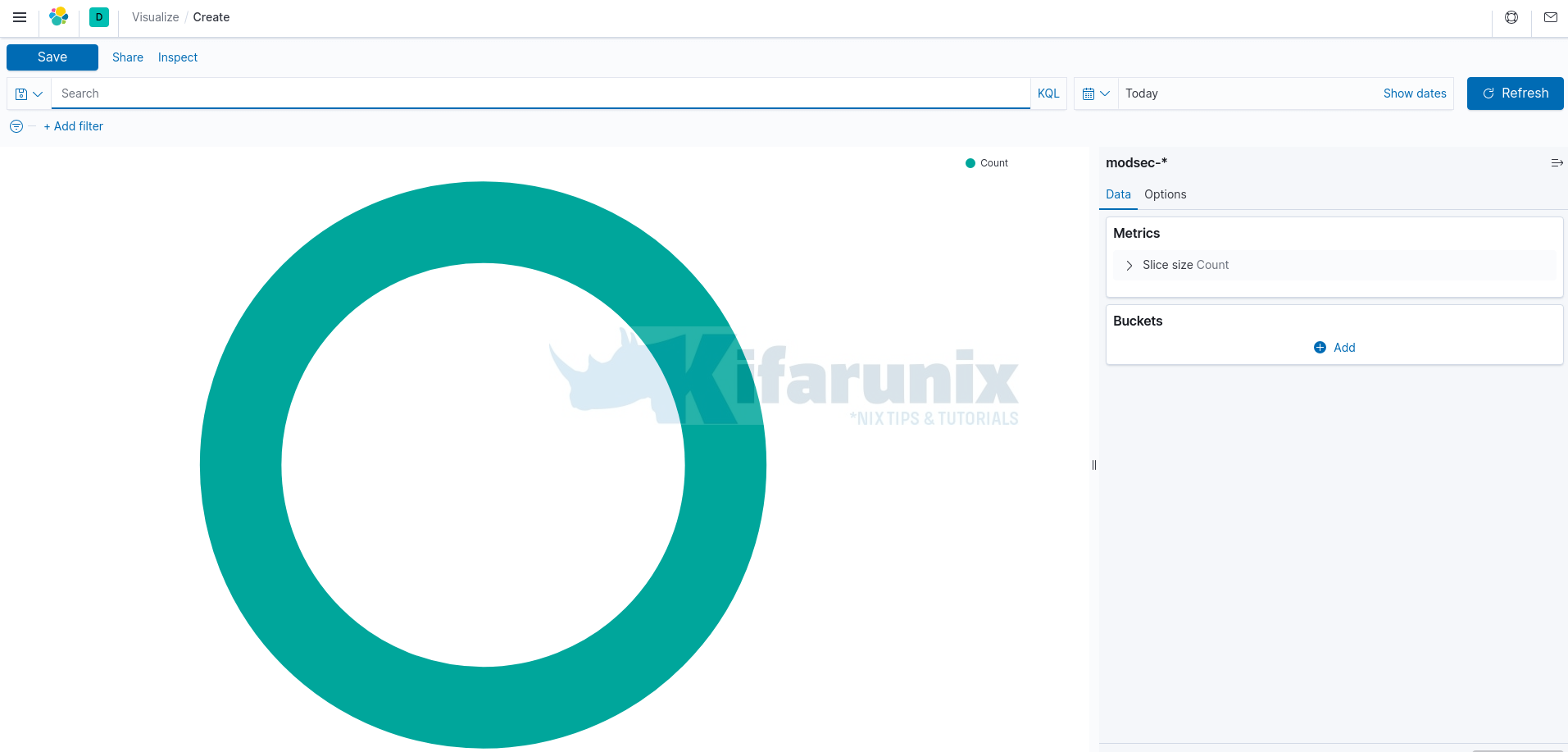
Next, you need to define your Pie Chart Metrics and Buckets.
Bucketsare used to group data or sets of documents based on certain criteria.Bucket aggregationis used to specify the slices to display in a Pie chart. Aggregation refers to the collection of documents or a set of documents obtained from a particular search query or filter.Metricson the other hand refers to values extracted from the documents that are being aggregated. Example is theNumeric metrics aggregationswhich output numeric values.
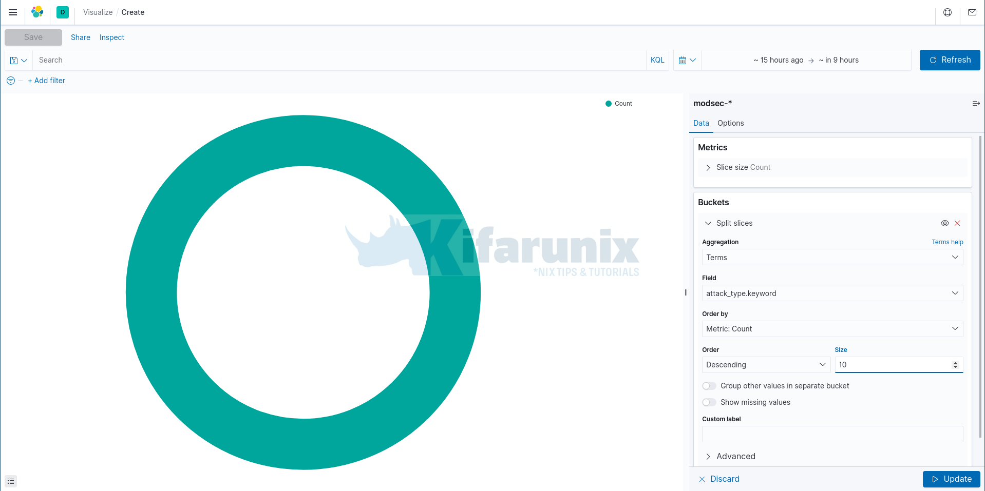
Under Data tab;
- Choose the Metrics aggregation type. We use the default one here,
Count(returns a raw count of the elements in the selected index pattern). - On the Buckets, click Add > Split slices.
- Select the type of Bucket Aggregation. Choose Terms (enables you to specify the top or bottom n elements of a given field to display, ordered by count or a custom metric).
- Select the field from which data should be extracted. In this case, we select attack.type.
- Order by Count Metrics.
- Set Descending order and set the size to 10.
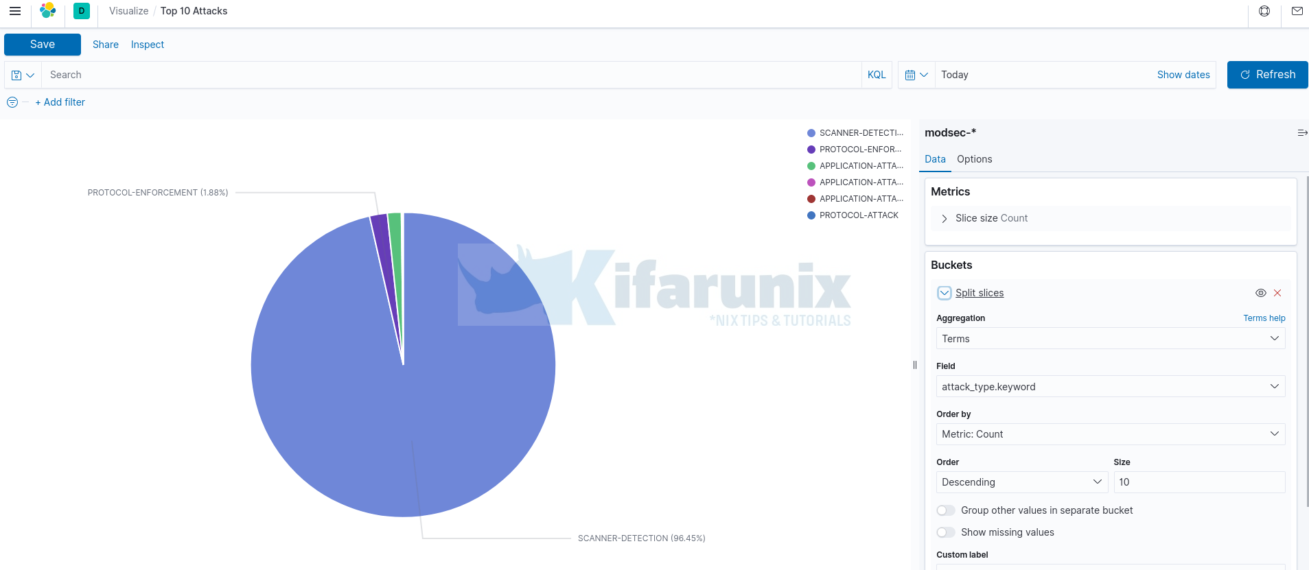
Under the Options tab, are the chart customizations options. We disabled the Donut format for the chart in this section and also enabled Show labels.
Click Update button at the bottom right corner to save you chart settings.
Once done setting up the chart, click the Save button at the top left to name your chart and save it. We call the chart Top 10 Attacks.
Top 10 User Agents
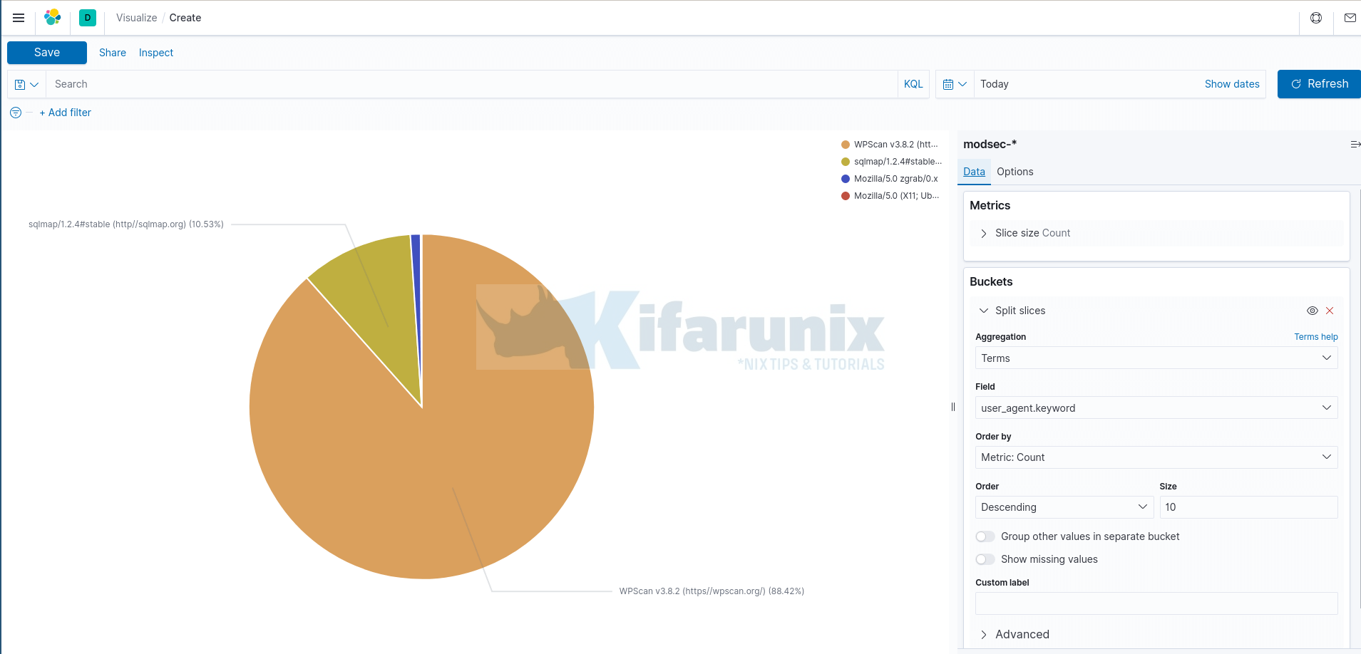
Similarly, we use the same approach above to create a new chart for the Top 10 user agents.
However, when selecting the data field, we select user_agent.keyword as per our Elasticsearch index field.
Top 10 Attacker IPs
Next, let us create a visualization for the Top 10 Attacker source IPs and their count.
In this visualization, we will use Data table aggregation type.
Create Kibana Data Table
To create Kibana Data table, navigate to Kibana Visualize menu > Create visualization > Data table.
Select the Elasticsearch datasource index.
This opens up a default table with just the Count aggregation metric enabled.

You can create your data table based on an existing saved search or a new search.
Under Data tab;
- Under Metrics, select an aggregation type. Again, we use the default one here,
Count. - Under the Buckets, this is where we add the columns to be displayed on the table. Hence, click Add > Split rows.
- Select the Bucket Aggregation type. Choose Terms (enables you to specify the top or bottom n elements of a given field to display, ordered by count or a custom metric).
- Select the field from which data should be extracted. In this case, we select src_ip.keyword as per our ES index fields.
- Order by Count Metrics.
- Set Descending order and set the size to 10.
If you like, you can see other settings under Options tab.
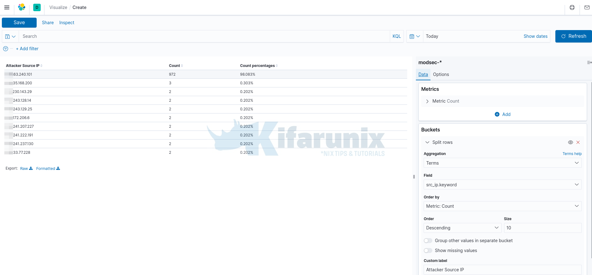
Click the Save button at the top left to name your data table and save it.
Top 10 Request URIs
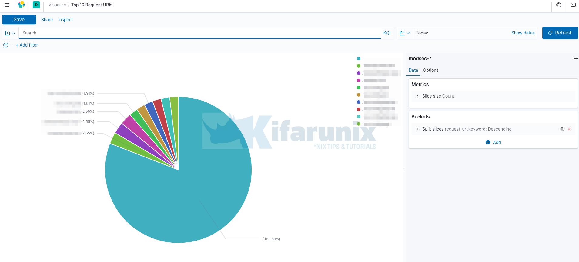
You can also create Top 10 request URIs visualizations. For this, we use Pie chart and hence, the approach is the the same as above.
For the data field, we use request_uri.keyword as per our ES index fields.
Save and name your chart accordingly.
Add Visualization Charts/Tables to Kibana Dashboard
Once you have created your visualization charts or tables, you can now create your own dashboard where you can put together all the visualizations.
To add Kibana visualizations to Kibana dashboard;
- On Kibana menu, Click Dashboard > Create dashboard.
- Add an existing visualizations we already created above.

Select the visualizations panel to add to the dashboard by clicking on it.
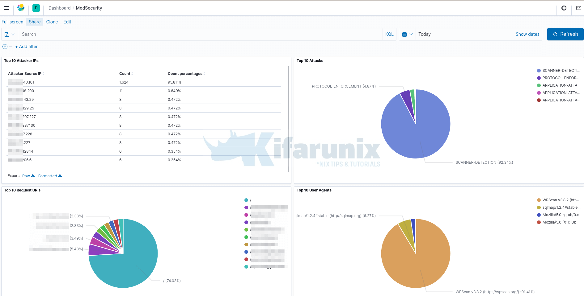
Click Save button at the top of the page to save your dashboard.
And there you go. You can add more visualizations as you wish.
Further Reading
Other Tutorials
Install Elastic Stack 7 on Fedora 30/Fedora 29/CentOS 7
Install and Configure Filebeat 7 on Ubuntu 18.04/Debian 9.8

